Saturday, 26 February 2011
what's on the shelf?
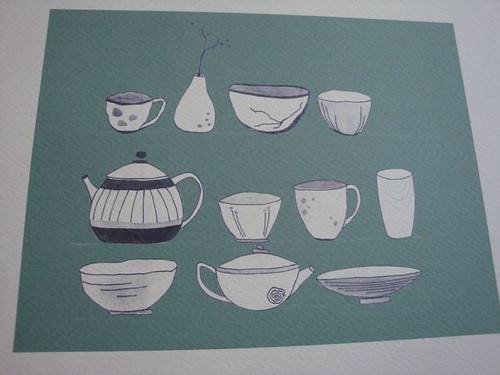
A little while ago I got all nostalgic for the small shelves of bowls and cups I had in my wee kitchen in Japan. They were tiny and sat just above my sink but had a window behind them so the light came through the back of all that lovely pottery. It was very pretty to look at in the morning. Nostalgia is a funny thing.
So out of a natsukashi moment came this illustration-come-giclee print. It's available in green and blue, my two favourite colours at the moment. Almost any shade of green or blue is likely to come from my fingertips these days.
I have a good kiwi friend who lived in Japan when I did. She emailed this morning talking of the sorrow they are going through post Christchurch quake. My heart goes out to you NZ.
Labels:
blue,
giclee print,
green,
illustrations,
japan,
mizu designs,
new giclee print,
NZ,
pottery,
shelf life green
Saturday, 19 February 2011
paper
I really wished I'd known that Cibi in Collingwood was having a launch last November of these beautiful Cibi Siwa washi paper bags. Nothing like discovering things too late, is there? I think these are so wonderful in their simplicity and really sum up the idea of wabi sabi perfectly. Given Cibi is only a short bike ride from my house and has some the most delicious Japanese food on offer in Melbourne I'm hoping they still have some of these in stock in their shop. Would it be too sacrosanct to consider printing on one?
BSG has a good works on paper show on at the moment. At the opening last night I was especially impressed with a giant (not kidding it was HUGE) lino cut by Victorian printmaker Sue Fraser. You can see it here (it's #40).
Labels:
cibi,
cibi siwa,
japan,
lino cuts,
printmaker,
sue fraser,
washi
Sunday, 13 February 2011
blue
And then there was blue.....
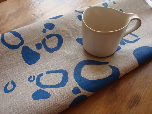
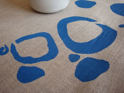
But screen printed this time. Once again on 100% flax coloured linen tea towels. I cut a stencil by hand and modified the design just a little so it could be screen printed. I've decided to call this design banksia pod because it was inspired by some ink paintings of pods I did last year. M just told me these work really well with our kitchen colours. But I am letting them go: if you fancy them they're in the shop now.
Monday, 7 February 2011
texture
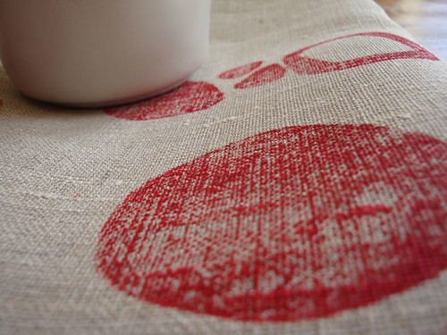
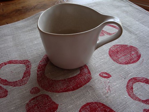
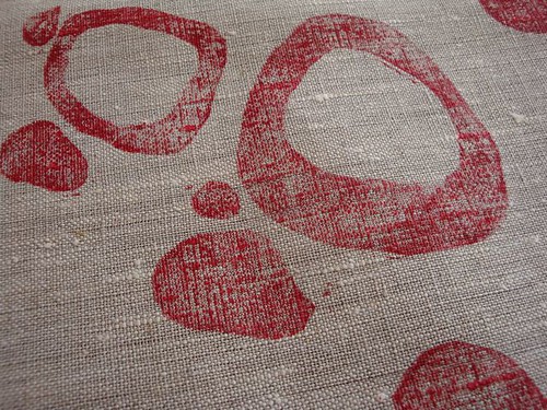
I love the course texture of 100% linen. But it's not the easiest fabric in the world to block print on. This is a test run on an oatmeal linen tea towel. I'm still perfecting it but think I like the dirty red colour against the warmth of the oatmeal.
UPDATE: I've worked out all the kinks and so now have some of these in my shop.
Friday, 4 February 2011
linen
This is a beautiful film by Benoit Millot about linen, a fabric I simply love for all kinds of reasons.
"......linen is rather like wood. There's a structure. It's a living material."
I hope you watch it and enjoy it as much as I did. Thanks to Lena for helping me find it.
"......linen is rather like wood. There's a structure. It's a living material."
I hope you watch it and enjoy it as much as I did. Thanks to Lena for helping me find it.
BE LINEN MOVIE from Benoit MILLOT on Vimeo.
Labels:
benoit millot,
european linen,
european textiles,
fabric,
flax,
linen,
nature,
textiles
Subscribe to:
Posts (Atom)